
I chanced upon a rather intriguing story today on the mystery of Dennis Ritchie’s Harvard PhD thesis. As those of us who grew up with Unix and C will know, Ritchie was a demi-god who worked at Bell Labs and helped create both—which underpin most every system we use today. Apparently, Dennis never submitted his PhD thesis, yet his Turing Award citation refers to him as having earned a PhD from Harvard in 1967! While why this happened is intriguing in itself (I will not spill the beans here! (more on this mystery here)), what caught my attention was the effort people have put into solving a more fascinating mystery: How did Ritchie typeset the equations so elegantly in his unsubmitted thesis when, presumably, the technology did not exist in 1967? Reading through some of the papers took me back to my first experiences in typography—which improbably started with a golf ball that wasn’t really a golf ball!
The golf ball that changed everything
In the late 70s, my uncle, who worked for IBM, brought a refurbished IBM Selectric typewriter to Bangalore. This wasn’t just any typewriter—it was one that let you peer into the future. One entire box was carefully packed so the (rather heavy) machine would not be damaged while making the arduous, multi-hop trip from New York’s JFK airport to Bangalore’s HAL airport. The IBM Selectric, introduced in 1961, featured an innovative chrome-plated plastic “element” (frequently called a “typeball”, or less formally, a “golf ball”) that electro-mechanically rotated and tilted to the correct position before striking the paper—a fundamental difference from traditional typewriters that had a fixed font and type bars that turned a typist’s keyboard actions into printed text on the sheet of paper. Think today’s drive-by-wire cars vs ones with manual steering in yesteryears. My father treated this machine with the reverence one might show a sacred artifact. His technical papers and his students’ PhD theses were all written on this electro-mechanical marvel to be shared with his technical brethren.
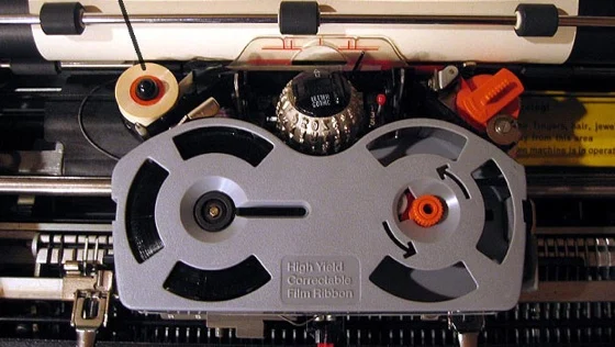
Figure 1: The IBM Selectric opened up to show the innards, including the golf ball and the self-correcting ribbon—another nifty innovation

Figure 2: The IBM Selectric’s golf ball head
What captivated me was the ability to change fonts mid-sentence. The typeball could be easily interchanged to use different fonts within the same document typed on the same typewriter, resurrecting a capability which had been pioneered by typewriters such as the Hammond and Blickensderfer in the late 19th century. Imagine—in 1976, I was trying to wrap my head around a Courier font! This wasn’t just typing; it was typography coming alive under my fingers.
The Selectric represented something profound: IBM sold 80,000 Selectrics in its first year — four times the company’s projections — and more than 13 million units in total. Each golf ball carried 88 characters, spinning and tilting with mechanical precision that seemed almost magical. The design eliminated the bane of rapid typing: jammed type bars. And with no bars to jam, typists’ speed and productivity soared.
From Gutenberg to golf balls
To understand the magnitude of this innovation, we need to travel back to 1450s Mainz, where Johannes Gutenberg was solving a different but related problem. Gutenberg invented the movable-type printing press, which started the Printing Revolution. His genius wasn’t just in creating movable type—Chinese and Korean innovators had done that centuries earlier—but in perfecting a system that could mass-produce text efficiently in European languages.
Gutenberg’s newly devised hand mould made possible the precise and rapid creation of metal movable type in large quantities. This innovation meant that a single Renaissance movable-type printing press could produce up to 3,600 pages per workday, compared to forty by hand-printing and a few by hand-copying. The parallel to the Selectric is striking. Both innovations eliminated the primary bottleneck of their era—Gutenberg freed us from hand-copying manuscripts, while the Selectric freed typists from jamming type bars and fixed fonts. Both democratized the written word in their own way.
Stanford exposes me to the digital publishing revolution
Fast forward to 1985, when I arrived at Stanford as a grad student. I made the mistake of signing up for not one, but two particularly intense project classes (ME218 and ME210, for the cognoscenti) since I wanted to be sure I studied everything I could while still on the nine-month fellowship I was awarded. I quickly realized that touch typing was going to be a key skill; so I holed up in the Terman Engineering library during the first weekend and typing like a man possessed, taught myself how to touch type.
Bored with repeatedly typing “asdf;lkj”, I started experimenting. I began writing a letter describing my first two weeks in Stanford to friends and family in India—using every font the Mac Classic offered. This wasn’t mere novelty—it was Steve Jobs’ vision made real. His obsession with typography had transformed computers from calculation machines into publishing platforms. My letter became so popular that I continued sending them for many years, eventually morphing them into our family newsletter—a tradition that sporadically persists till today. And, into this blog.
TeX and LaTeX save the doctoral student
My typography education deepened when I encountered TeX and LaTeX. TeX is a typesetting program which was designed and written by computer scientist and Stanford University professor Don Knuth (also a Turing Award winner) and first released in 1978. Knuth created TeX out of frustration—when he saw for the first time the output of a high-quality digital typesetting system, and became interested in digital typography.
What made TeX revolutionary wasn’t just its quality but its philosophy. Knuth gave a lot of attention to the spacing rules for mathematical formulae. He used bodies of work that he considered to be standards of excellence for mathematical typography and built a system that could handle the most complex mathematical notation with elegance that word processors still struggle to match.
Leslie Lamport, yet another Turing Awardee whose neighbor I would later become in Palo Alto (small world!), built LaTeX on top of TeX, creating a higher-level interface that made this power accessible to mere mortals like me.
Unix and the text manipulation revolution
Parallel to this typographical revolution ran another stream: Unix and its text manipulation tools. When the Computing Sciences Research Center wanted to use Unix on a machine larger than the PDP-7 and Bell Labs Patent Department needed a word processor, Thompson and Ritchie added text processing capabilities to Unix and received funding for a PDP-11/20.
Dennis Ritchie and Ken Thompson didn’t just create an operating system; they created a philosophy of text manipulation. The tools they wrote—like troff, grep, awk, sed, sort, wc, tr, and so on—and the later tools they inspired—like Perl, Python, and Ruby—are the basis for all the Markdown/HTML/PDF transformations that are part of our daily workflow today.
The Unix philosophy—small tools that do one thing well, connected by pipes—transformed how we think about text. Every modern publishing pipeline, from web publishing to academic journals, carries DNA from those Bell Labs innovations.
From PostScript to PDF
As laser printers arrived at Stanford, we witnessed another transformation. PostScript gave way to PDF, creating a universal language for documents. This wasn’t just a format change—it was the beginning of truly portable documents, readable anywhere, maintaining their formatting across platforms and printers.Innovation is unrelenting
What strikes me most about this journey is the continuity. It begins even before papyrus in ancient India, where the Vedas—humanity’s oldest surviving religious texts—were preserved with extraordinary precision through oral tradition. These sacred hymns, composed between 1500 BCE and 600 BCE, were memorized with such exactitude that they survived millennia before being committed to palm leaf manuscripts.
The transition from oral to written was profound. Palm leaves, called Patra or Parna in Sanskrit, were used as writing materials in the Indian subcontinent dating back to the 5th century BCE. The individual sheets were inscribed with a knife pen, creating rectangular manuscripts that could last several centuries—though in India’s humid climate, they required constant recopying. Hindu temples served as centers where ancient manuscripts were routinely used for learning and where texts were copied when they wore out. This tradition of meticulous preservation and transmission represents humanity’s first great typographical achievement—not through mechanical means, but through human dedication to preserving knowledge.
From these ancient scribes working on palm leaves, to Gutenberg’s mechanical precision, to the dancing golf ball of the Selectric, to the mathematical elegance of TeX, to today’s web fonts and responsive typography—each innovation built on what came before.
The Selectric’s golf ball, which seemed so futuristic in 1976, was actually channeling an old idea—changeable typefaces—that Gutenberg himself would have recognized. By making the golf ball interchangeable, the Selectric enabled different fonts, including italics, scientific notation and other languages, to be swapped in. Similarly, TeX’s obsession with beautiful mathematics echoes the medieval scribes’ illuminated manuscripts, just executed through algorithms instead of brushstrokes.
The explosion of content
Each typographical leap hasn’t just improved quality—it’s exponentially increased quantity. The rapid economic and socio-cultural development of late medieval society in Europe created favorable intellectual and technological conditions for Gutenberg’s improved version of the printing press. The same pattern repeated with the Selectric, with desktop publishing, with the web.
Today, we publish more content in a day than humanity produced in centuries before Gutenberg. My father’s carefully typed technical papers on that precious Selectric have given way to instant global publication—like this blog that I am typing in an app in my browser and publishing on my personal soapbox. The letters I sent from Stanford, experimenting with fonts, have evolved into blogs, tweets, and instant messages that circle the globe in milliseconds.
Yet something remains constant: the human desire to make our words beautiful, to give our thoughts form that honors their content. Whether it’s a monk illuminating a manuscript, Gutenberg arranging his type, my father changing the golf ball for a mathematical symbol, or me choosing the perfect font in a blog—we’re all part of the same, long tradition.
The golf ball has stopped dancing, replaced by pixels and vectors. But the dance itself continues, as we find new ways to make words sing on page and screen. Typography isn’t just about making text readable—it’s about making knowledge accessible, beautiful, and democratic. From Gutenberg’s press to the Selectric’s golf ball to the screens we read these words on, each innovation has brought us closer to that ideal.
In our family room, I have a collector’s Mac Classic. Now, I am on the hunt for an IBM Selectric along with one of those IBM golf balls—Courier, naturally. I hope that it will sit on a shelf in my study in the not too distant future, a tangible reminder of how far we’ve come, and how each generation builds on the shoulders of giants, one character at a time.


 music")


